
Portal list
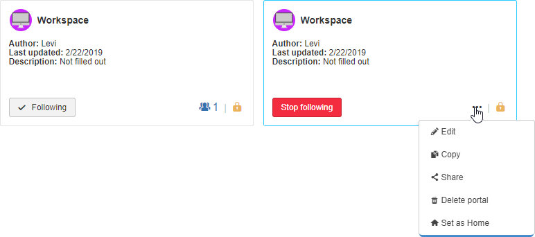
The portal list display has been updated so that all portals displayed are visually aligned.

Each miniature displays basic portal information and, by hovering the mouse over them, there are buttons that allow executing quick actions, without the need for opening the portal for viewing.
Portal list filters
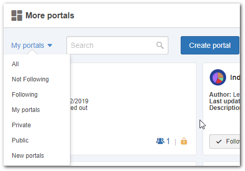
For filtering portals, simply click on the filter selector next to the search field. The menu displayed allows filtering portals you are not following, portals you are following, portals you have created, private portals to which you have access, public portals or new portals.
New portal
When the user clicks on Create portal, a portal in editing mode will be opened.

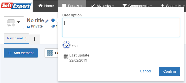
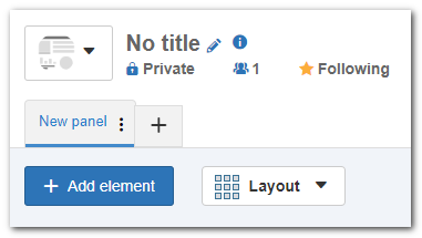
The following information is displayed in the portal header:
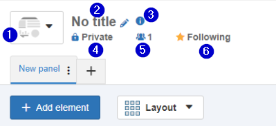
1.Portal logo
2.Portal title
3.Indicator for portal description
4.Indicator for Private or Public portal
5.Indicator for how many people are following the portal
a)There is no longer the option of displaying who are the portal followers, just the number of followers.
6.Indicator of you following the portal that is open
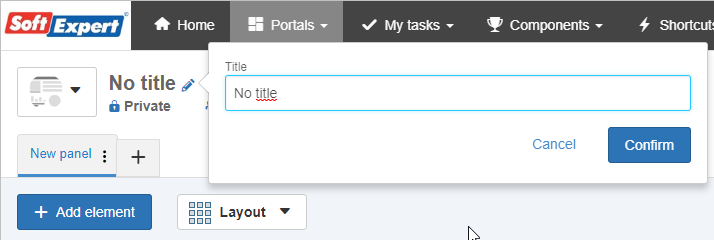
To edit the portal title, simply click on the pencil icon.
To edit the portal description, simply click on the icon.
Portal editing
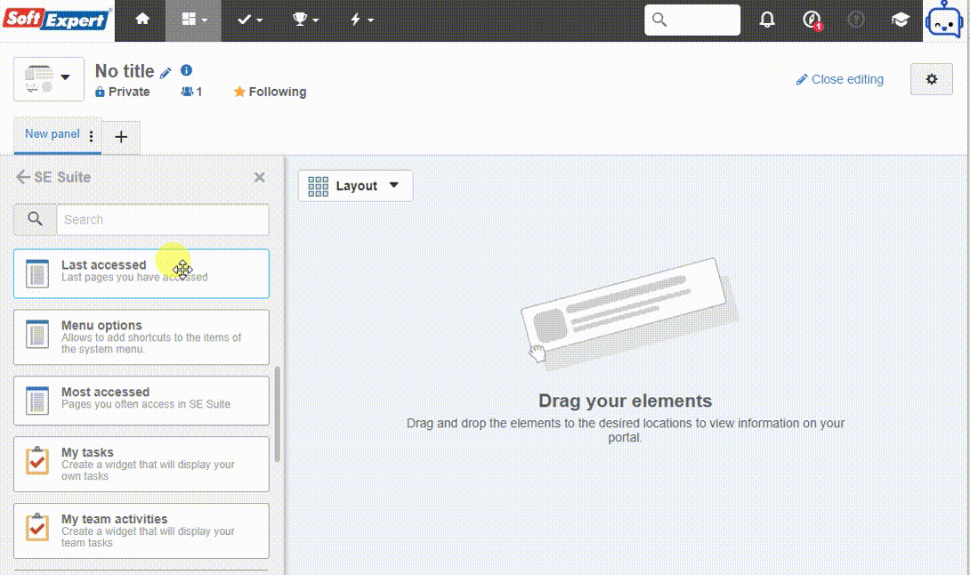
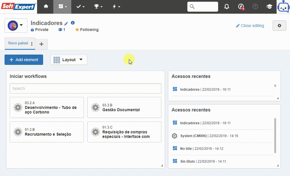
To edit the portal, the user with permission to execute this action must click on Edit portal.
After entering the edit mode, the portal displays the Add element and Layout options.
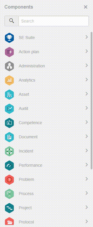
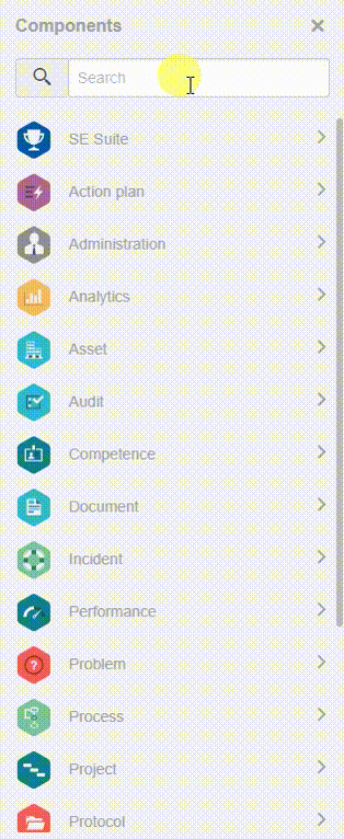
After clicking on Add element, a sidebar will be opened, displaying all components to which you have access and the respective widgets within each component.
To add widgets, simply click on one of them and drag it towards the portal body.

The "Customized" token that existed in the older portals and that worked as categorization for widgets that were not related to the components has become "SE Suite".
The RSS Feed widget has been discontinued, but it will still work if it is configured in a portal. However, if it is deleted, it will not be possible to add it again.
Widget filters
The user may search for widgets in the adding element sidebar. If found, the search result will bring a SoftExpert Analytics vision, a graph analysis, a SWOT analysis or a strategy map (the final three are part of the SoftExpert Performance component). If a widget is found, it will be displayed at the end of the list.
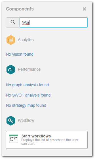
Vision listing of the Analytics component
From this version onwards, the visions that have been created through the SoftExpert Analytics component will be displayed directly on the adding element panel. To do that, simply click on the SoftExpert Analytics component in the panel and drag the desired vision to the portal body.
Graph analysis, SWOT analysis and Strategy map listing
As in Analytics, when clicking on the Performance component, the first three items on the list are Graph analysis, SWOT analysis and Strategy map separators that display data previously recorded in the component.
Portal tabs
To rename the tabs, simply click on the  icon displayed on the tab you wish to rename.
|
|


Portal logo upload
When clicking on the default portal logo, a menu is displayed, allowing you to edit the portal logo. In the menu, it is possible to select an image from the gallery or upload a new image. To upload, simply drag the desired image to the space defined for upload or click on "select" to open the file explorer on your computer.
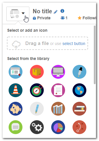
The dimensions of the new image must be up to 100px by 100px; they must be in .jpg or .png format and their size must be up to 300kb. |
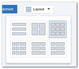
Portal layouts
The new portal has flexible layout, that is, after added, the widgets may be resized and repositioned according to your needs.
To resize a widget, click on the " " indicator positioned in the lower right corner and keep pressing it, and then drag it until it reaches the desired size.
To reposition a widget, click on it and drag it to the new position.
The layouts that exist in the layout selector work as reference for widget disposition. Whenever necessary, you may resize and reposition the widgets as you see fit; thus, the "structural" layouts no longer exist in this new version of the portal.
Widget configuration standardization
All existing widgets are being updated and, throughout 2019, they will follow a standard for the configuration screen. When the user clicks on Configure, the widget will be expanded to have greater prominence on the screen, and the configuration fields will be displayed next to it. When the user clicks on Save, the widget returns to the previous view.
Portal share
Aiming at facilitating the understanding on who has access to view or edit a portal, the sharing types have been separated in portal configurations. By selecting a user, department, position or team in sharing, it will be possible to define if it will have permission to view or edit the portal.
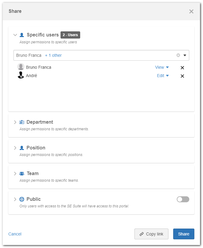
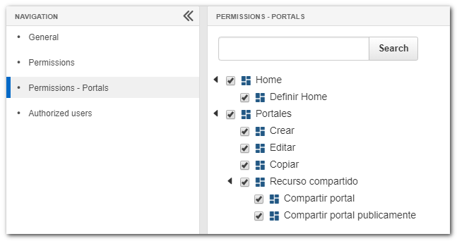
To block other users from using public sharing, a user with access to the access group permission configuration must simply disable the new permission created for this scenario.
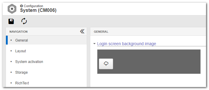
Login screen
The login screen has been redesigned with the aim of highlighting the visual identity of the company. The login screen will display a default SE Suite image, but it may be edited to a new image through the system configuration menu (CM006).

The created field is called Login screen background image, and allows the upload of images of up to 1350px by 1080px, in .jpg or .png format, and with up to 1mb in size.
System home
In this new version of the environment, the home editing is only possible through the Portals menu, that is, if it is necessary to edit content from Home, the user must, firstly, search for the portal that is set as Home (in the portal list screen) and then edit it.
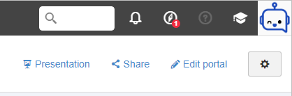
Presentation mode
The portal presentation mode has not suffered any changes.
